The (Drupal) Content Editor deserves an easy Life

Article content
You know the way you design a beautiful website, but the back end edit page is long, and ugly, and hard to follow, and ... well, let's fix that mess so website end users and content editors both have a great user experience.
This blog post is based on a talk I gave recently at Drupal Open Days Ireland 2015 held in the Guinness Enterprise Centre in Dublin last week. The genesis of the talk came from my observation that web developers often presume that the "end user" of their product is the person who visits the website to make a purchase or perform an action. My contention is that the content editor is the end user of the web developers and the site visitor is the end user of the client. It's not that simple of course, but the bluntness will do to allow us to get the conversation started.
If we accept this theory, then surely we should put as much effort into the user experience (UX) of the content editor as we do into the finished front end of the website. I met with a potential client recently who told me their website (not built on Drupal) is not very good "because it's not updated enough; it's not updated enough because it's hard to use". This organisation is losing money, losing site visitors, losing SEO, and ultimately spending more time publishing to other platforms all because the editor experience is not up to standard for them.
When using Drupal, there are a lot of things we can do to make the editor experience more enjoyable - lots of small things that can in aggregate add up to a much more pleasant user experience for the content editor. Here are some of them:
Admin Theme
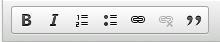
Drupal 7 ships with the Seven admin theme. We find this very good and enable it for content editors on all of our websites. Ember and Adminimal are two other Drupal admin themes. We gave Ember an extensive test but found it lacking. We are quite impressed with Adminimal (which is like an enhanced version of Seven), but haven't come to a definite conclusion on whether we prefer it over seven. Using Seven versus Adminimal will give you buttons like this:

Create Shortcuts
In general I don't like the Toolbar and Shortcuts menus. Since I usually need quick acess to lots of links I like to use the Admin Menu module. However, as a content editor, the Shortcut menu is a great option. On this website, I've created links for creating content, finding content, checking unapproved comments, and clearing the cache.

WYSIWYG
Though as developers we might like the wysiwyg to die, the simple fact is that clients want them. I actually think they are right to want them. I see nothing wrong with a client wanting to put some text in bold, or italics, or bullet points. My advice when it comes to wysiwygs is that less is more. In general I aim to give no more than 6 buttons on a wysiwyg - bold, italics, number list, bullet list, link, and unlink. You'll notice headings is not in that list (H1, H2, H3, H4, H5, H6). The reason being, I have found clients sometimes lack a knowledge of semantic data and will use headings for styling - as in, if they want something about 20 pixels high, they might use H3. To counteract this, we use field collections for paragraph types with all the attendant fields they might need, heading, text, media, etc (media sets we call them). We are starting to experiment with the Drupal paragraphs module at the moment.
Big Long Forms = no no
Bryan Braun had a great blog post a while back If Gmail were made by Drupal. In it he showed a GMail screen and then rebuilt that screen in Drupal. Suffice to say, it was a long form. For my presentation I created a content type called "Big Long Form" with text fields, image fields, taxonomy fields, and file fields. It wasn't overly long, but when showing how it worked and trying to remember what was where it became clear very quickly that long (undocumented) forms are not sustainable for the content editor. How to fix this?
Short, tabbed forms = go go
As a matter of course, when building Drupal websites, I install the Field Group module. This allows me to put form fields into groups - all text fields in one group, all taxonomy fields in another, all media fields in a third, or whatever categorisation system I wish. Taking this approach, the content editor is not overwhelmed with options and can simply click on the tab of the category he or she wishes to edit. The field group tab I most commonly use for this is the wonderful Vertical Tabs.
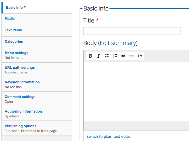
Now, doesn't that form look much easier to manage? Well yes and no. Yes it's easier to manage, but the content editor might have too many tabs now, perhaps we don't want them being able to edit menu items or change the URL alias. Can't we simplify this?
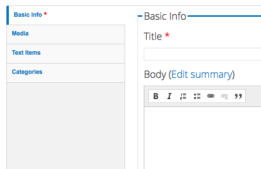
Simplify things
Using Drupal's Simplify module we can, well, simplify things. In this instance, I am going to remove the admin-related tabs from the editor role, so they will only see content-related tabs.
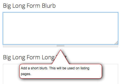
Not just random Acts of Kindness
Be nice to your content editors. Provide them with help text. Not just randomly, but on all form elements. For example, on an image field, let them know that the expected dimensions of the image are 450px by 220px and that the image will appear on the news listing page.
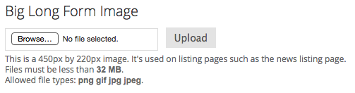
(Excuse the title on that image field - it was just for demonstration purposes.)
Beautify the help
Once you have all of your help texts in place, the form will become a little longer. This isn't necessarily a good thing. I like to install the Beauty Tips module to insert the help text in popup bubbles, visible only when the user clicks on that field. It also allows me to write slightly longer help texts for my clients.
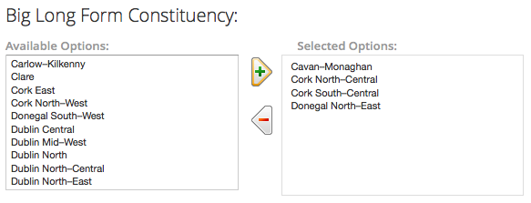
Selecting from a large range of options
I once created an Organic Groups-based website with 2,500 groups. Every time a new feature was created for a group, we had to decide which groups were ready for this new feature. We then had to try to select the groups from a tiny input/select box trying to grab, for example, 179 groups of 2500. To say my finger often slipped off the mouse, or missed a group, is an understatement. With Drupal's Multiselect module all of this hassle could have been avoided. Multiselect allows editors to select available list items and then tick an arrow to send them to the selected options list and vice versa.
Making the link
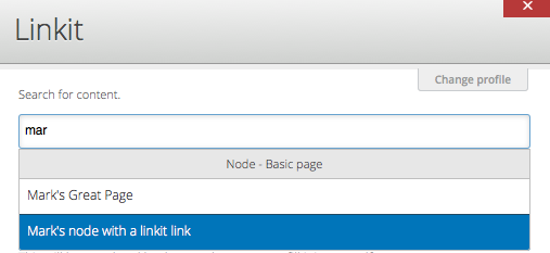
The content editor often has trouble with links. Finding pages, linking to them, then editing the linked page (resulting perhaps in a change of URL), but forgetting to edit the page that links to it and then ... (it's all getting complicated). Using LinkIt module, editors are given a much better link interface to find the content they wish to link to, which will also automatically update the links if they change. Add to that the Link Checker module and you've a pretty cool link infrastructure in place.
Dashboards
Once you have your content editor experience created for editing pages, don't forget to create a dashboard for your content editors to give them an overview of the website. This can be something simple using the Dashboard module or more complex using Workbench and Workbench Moderation modules. It will depend on the workflows in place in your clients organisations. At a minimum - with my content strategist hat on - I create blocks of most recently added/updated content, least recently added/updated content, content due for review, and unapproved comments.
That was as far as my presentation got. I'll follow up this blog post with another one soon detailing some other modules that I mentioned in passing during the presentation, such as admin views, honeypot, webform default fields, conditional fields, paragraph module, field collection, and more.
Any thoughts? Anything left out (I'm sure there's loads more)? Please add them to the comments.
(slides for presentation can be found here.)
Related Blog Posts
-

-
 21 June 2024
Starshot to take Drupal to infinity and beyond
-
 7 March 2024
Annertech is a Drupal Certified Platinum Partner