GMIT: The intuitive website that makes it easy for prospective students to find the perfect course
Galway-Mayo Institute of Technology is a third-level educational institute with five campuses, servicing the needs of students on the west coast of Ireland. Its new site needed to reflect a changing third-level education institute. But it also needed to attract new students and to make it easy for them to find the courses they wanted to study. The solutions? Search, integration and user-centred design.
The challenge
Back in 2019, Annertech undertook a research project with GMIT to understand the issues they were trying to solve as part of the new website. It was agreed up front that users should be front and centre of the solution.
Through workshops with an appointed research steering committee within GMIT, it was quickly evident that creating solutions for prospective students needed to be the focus of the project.
By engaging in interviews and usability testing with sample sets of each of the key persona types, it allowed us to expand on the difficulties and needs of each of the main demographics. This research formed the basis for the redesign project.
The existing GMIT website was eight years old by the time the project started. It had no UX input when originally designed and, over the intervening years, had organically grown into source of important information which didn’t represent how GMIT saw itself or the great work it was doing with students.
The solution
Although the GMIT website is visited by an extremely broad range of users, research showed that prospective students were the dominant group. The primary goal of all these prospective students remained the same – to research courses that interested them to make a positive change to their future. With this at front of mind, the focus would be on a creating a simple, intuitive course search.
Our solution took a four-pronged approach:
- Make Search easy and immediate.
- Allow users to find the course they want, how they want.
- Facilitate GMIT in managing course information seamlessly.
- Simplify the application process.
1. Make Search easy and immediate
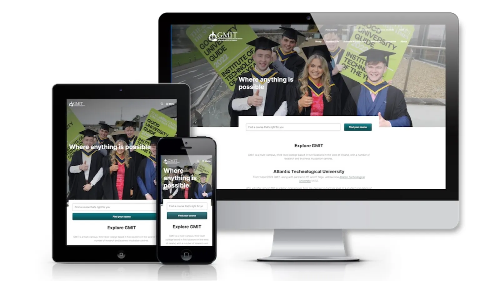
Being the primary goal, it was important to make search available immediately. To make this possible, a large, unmissable course search box is available within the hero area of the homepage. While a range of possible filters are available to use for filtering courses, we opted for a simple text search on the homepage to avoid creating any type of barrier to users. This allows GMIT to funnel users towards the richer Course Search page where they can interact at a more detailed level.
2. Allow users to find the course they want, how they want
One of the more interesting findings from the original research was that while all key user groups were ultimately researching courses, they expect to be able to find them using different angles that are most important to them. A simple example of this is that mature students are more restricted in terms of the location in which they can study, while students applying through the CAO from the school system are much more interested in the experience.
We approached this challenge in multiple ways.
- Allowing for filtering by main areas (Course Type, Mode of Study and Location) allows user to filter the vast course information by what’s important to their own decision-making process.
- Each course needs to contain a lot of information. By simplifying crucial information on the splash page for each course, prospective students can now easily scan and compare courses easily.
- A tabbed approach was used for course content. This would ensure we could present the information in the order we would expect a prospective student to need it, and also display the broad range of course information in easily digestible topics.
- Including rich media in the form of video is important to show prospective students real lecturers and alumni who have been through the same process and emerged successfully in their professional careers.
- Including a highly visible, easily accessible “How to Apply” button gives prospective students a clearly actionable next step if they have found the information they need.
3. Facilitate GMIT in managing course information seamlessly
With great power comes great responsibility. Courses are the central focus of GMIT’s content and this meant that it was vital to have the right content in the right place. With constant changes to course information, the workload in keeping courses up to date with the most recent information would be quite the task.
By integrating directly with GMIT’s course management system Module Manager, changes to courses and modules now flow automatically from the source to the website. This allowed GMIT to focus on richer content like testimonials from student and lecturers to really give students a feel for what their future holds.
4. Simplify the application process
Although the primary goal was to allow for seamless research, facilitating prospective students in taking the next step to apply for their programme of choice remained equally important. Our research showed us that prospective students can come from broad range of backgrounds, each with their own specific entry requirements.
The content for each of these entry points was dissected across the site on individual pages, which made it difficult to have a clear location for this type of information. Working through these possible flows allowed GMIT to simplify the signposting for the application processes to a single “How to Apply” section.
The idea behind this section was a top-down approach to allow any prospective student to find the right application for their particular scenario.
Approach to Design
A third-level educational institution needs to make a massive amount of information available to a broad range of users. The trick was how to access it and how to present it. Although lots of work went on in the back-end to connect all the dots, the design was essential to ensuring that it would be presented to the user in a way that didn’t intimidate them or overload them with information.
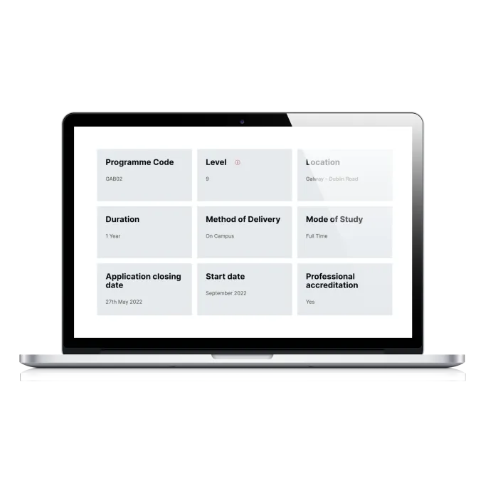
There were details that did not live in Module Manager (things like CAO points, location and mode of study), and this information was important to decision-making. We created a way to make it available in a digestible, easy format (see image above).
Conclusion
Galway-Mayo Institute of Technology needed to redesign its website, which was outdated and didn’t reflect the high standard to which GMIT holds itself, or appeal to the students who wished to study there.
By putting prospective students at the centre of the new website, the result was a sleek, fresh user experience that enables the institute to fulfil its mission of providing students with a transformative educational experience. And it all starts with their first visit to the website.
“We worked with Annertech to design and build a new website for GMIT, replacing a website of 4,000+ pages that was eight years old. Annertech worked with us from the outset, from stakeholder research right through to the design and implementation of www.gmit.ie. They seamlessly integrated the website with our internal systems so we could display detailed course and module information for prospective students, teachers and career guidance professionals for the first time in a user-friendly way. We are delighted with both the fresh new design and the user experience of the new site.”
Karen Smyth, Marketing Officer, GMIT
Related Case Studies
-
 Redcar & Cleveland Borough CouncilLocalGov Drupal
Modern and accessible: Redcar and Cleveland Council's new LocalGov Drupal website