5 Tips for a Responsive Website

With decades of experience, Anthony leads the Annertech Managed Services Team, delivering top quality design, development, and, ultimately peace-of-mind services to all of Annertech's wonderful clients.

Article content
This month we share our top tips for implementing a responsive website.
Last month I wrote about why we care about responsive websites, and why you should too. This month I'm going to brush the surface of how one might achieve such a goal.
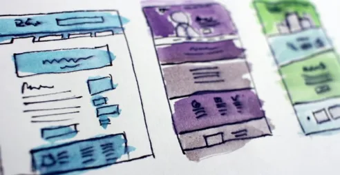
Responsive Buzzword Bingo
I'm not about to go knee-deep into the semantics of the various jargon words surrounding this topic and their pros and cons, but here are broad descriptions of some of the approaches.
A responsive site uses fluid grids and fluid images to resize according to screen width. A fluid grid or image does not have a fixed width, but rather it expands to fill the available space. This is backed up by media queries to change the style where needed at certain widths, or "breakpoints". A good way of thinking about a breakpoint is this: you need a breakpoint (i.e. a change in styles) at the width at which your layout starts to look broken.
An adaptive approach chooses specific fixed widths, so you get one layout for mobile and one for desktop and a fixed width for each of those. An adaptive theme does not typically utilise fluid images or grids.
Mobile-first is a design philosophy based upon the assumption that the smallest screen should be catered for first and the pages built up as screen size increases. This is the polar opposite of the traditional 'build it for my desktop and maybe think about mobile later' approach.
Mobile websites are another alternative. This is a separate site, serving content at a separate URL.
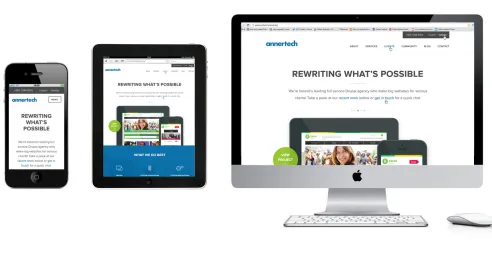
At Annertech, we would choose to build a responsive, mobile-first site on any new build.
Tips for Responsive success
1. Think about interactions.
A web site is not a static image. The designers of a website need to plan for how a user interacts with an application, but also for how a site interacts with the device. How should the various elements on the page sit on a portrait iPad? What about a monstrous home-cinema screen? Should they be stacked, or sit side-by-side? What should be displayed on a phone? They need to think through tasks and workflows and how the site works. How will the user perform tasks? Where will they be doing it? Does the action button need to be sized for and accessible to a thumb?
2. Optimize images
Fluid images are great, but downloading huge images on mobile sucks. A fluid image carries the same byte-size (i.e. the same amount of data has to be downloaded) whether presented on a tiny phone or a huge monitor. Downloading a one megabyte image over broadband might not make you blink, but doing the same over a tenuous edge network on an expensive per-megabyte data plan will make you think twice about accessing a site. Until it becomes commonplace to be able to send different images sizes to different devices, we need to optimise both our use of images and the images themselves. A big hi-resolution background image might look great on desktop, but it is just a pain to download and may never be seen on mobile. So at design time, ask yourself: do I really need this? In Drupal, we have the benefit of image styles to set our image sizes. Use these to make sure we are only serving images as large as they need to be for their use-case.
3. Design in the browser
When designing, a static design comp (i.e. a mock up of a page) can get you started, but it can account for neither all the differing screen sizes nor interactions between user and app. Whilst Photoshop can get your concepts down, there comes a time to leave it behind. Design in the browser is invaluable for creating out responsive layouts. Using this approach, we build interactive prototypes that you can use to get a real feel for how your finished website will work on different devices.
4. Use a CSS Preprocessor
If you have not embraced the CSS preprocessor revolution yet, now's the time to get on board. CSS preprocessors allow a developer to write far more efficient, readable and understandable code, which is compiled down to normal CSS for the browser to understand. It dramatically increases your effectiveness when styling a website. At Annertech, we use the power of SASS and Compass to solve amazingly complex problems efficiently and effectively.
5. Make it fast
Don't forget about performance. Ever. From the start of your mobile-first design, think about your goal of delivering the content your users want as fast as possible. Do you need that background image. Do you, in fact, need any images? What about that web-font? Can you use Georgia instead? Can your design embrace consistency across the site, rather than adding new design elements on every page? It's a wise approach to set a 'performance budget' when starting a project. This allows you to gauge just how much impact every additional request or asset or feature is going to have on the speed of your site. Always ask yourself: do I really need this? Remember, people don't like to wait! Have a look at this presentation from DrupalCon Amsterdam, where they talk about getting a page to a phone in under 1000 milliseconds.
So that's it - 5 tips to keep in mind when creating a responsive website.
If you want to discuss Annertech helping you build an award-winning website, please feel free to contact us by phone on 01 524 0312, by email at hello@annertech.com, or using our contact form.
With decades of experience, Anthony leads the Annertech Managed Services Team, delivering top quality design, development, and, ultimately peace-of-mind services to all of Annertech's wonderful clients.
Related Blog Posts
-
 3 April 2022
10 questions to critique a web design
-
 15 October 2019
Design Wars (or, Designing Web Projects)
-
 28 January 2015
Check out my website - it's responsive! Yawn!