10 questions to critique a web design

With decades of experience, Anthony leads the Annertech Managed Services Team, delivering top quality design, development, and, ultimately peace-of-mind services to all of Annertech's wonderful clients.

Article content
A design can make a project succeed or fail. But how do you know?
Previously I wrote about the hidden power that resides in the hands of a designer. Here are 10 questions you can apply to a supplied design, and the answers to them, or even the process of getting those answers, can bring a good design through to being a great design for your project. Remember, a design is just a picture until it is implemented, and it is important that the technical implementation is considered at the design stage.
1. Image sizes
How many image sizes are there across the site? How many different aspect ratios? Is there any commonality between images? Where can we reuse an image? In Drupal terms, we're asking: Can I use image styles? How many do I need? In which area of the site can I use each image style?
If there seems to be no obvious pattern, it can be worth articulating the benefits of using standardised image styles to the designer, such as performance and improved editor experience.
Remember that with a responsive design, images will usually stretch to fill a space, so image styles will generally set an image to its maximum required width. The single most important thing to consider is aspect ratio. If all the images have the same aspect ratio, then the implementation of a design becomes much, much more straightforward.
2. Content order
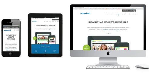
In a responsive site, as screen size diminishes, chunks of content flow around each other and jump below other content to accommodate the smaller screen width. It is important to realise that designs for smaller screens are sometimes supplied without due regard to this flow of content.
If you see content order on a mobile design that doesn't match up with that in the desktop design, ask about it. Either it is a mistake that is easy to rectify at the outset of the project, or it will turn into a monster that will eat your budget.
3. Horizontal alignment
People love horizontal lines. They particularly love columns of content, with line breaks, each of which line up with its neighbour in the next column. Unfortunately, the web, and responsive design in particular does not make such a design easy to implement.
It is bad practice to set absolute heights to elements in responsive design, to allow elements to expand as necessary, but without control of heights, any content change or width change will break the layout. As widths decrease, the height of content in a restricted space increases, which means that either the content will overflow its bounds, the content will be clipped, or the container expands, breaking the nicely arranged horizontal alignment.
There's no easy solution to this, so it is important to bring it to the attention of all concerned early on, lest it become an issue late in the project when deadlines are tight.
Often this issue only comes to light at launch time, when a client is putting real content, and replacing the nice, consistent three lines of dummy text in the design.
Ask how much content should be in the space. Ask whether the lines need to line up. Ask whether you want to rely on brittle JavaScript to make heights equal. Ask early.
4. Long titles
In a typical design, in my experience, titles and teaser text will be short, bordering on terse, lending themselves to smart, ordered layouts, and small containers in which to fit these elements.
When a site is live in the wild, titles can be really, really long. Editors are given content, control over which they may not have. The design has to accommodate this situation. Try swapping out
'Lorem Ipsum Dolor Sit Amet.'
with
'Many editors struggle to fit their content into the cramped confines of a small title block.'
Then see if the design still works. Ask about maximum title length and the ebb and flow of text on the web.
What happens with a long title on a small screen?
5. Large, full screen background images
Do you really need it? How big is it in kilobytes? Is it worth the extra page weight? Can the weight of it be reduced by blanking out where the content will live? What happens on small screens? Do they need to download it?
Think of performance, think of the value of that background image, and think of mobile users.
6. Fonts
What fonts are in use? Are they special? Is there a cost associated with them? Do they have all the necessary characters in the font? (e.g. I recently had to use a font that had no ampersand character.) Does the client know about any cost? Are they happy with that? Where are webfonts in use? Are they just for headings? Or are they for body text? Do they work on cheap, low-resolution screens? (If they don't, it's probably a poor choice.) Is the 'Flash Of Unstyled Text' before the webfont loads acceptable? How much does the font add to the page weight? Can you use a subset of the font? Do you need bold, italic and other variations?
7. View modes
How many different ways is the same content (e.g. a node or a bean) viewed on the site? Where on the site are these places? Each different representation directly corresponds to a View mode. If there are many variations, can these be rationalised? View modes are immensely useful, but there comes a point where YAVM (Yet Another View Mode) becomes painful. Less is more.
Another consideration here is seeing if view modes can be shared across content types. For example, is the listing page for news posts the same as the listing page for events? If so, we can use the same view mode for both? This will cut down on the time needed to style these view modes with CSS.
8. Configuration
Does the client need to configure anything? What does the site editor want to be able to change? Should footer blocks be editable? Or any of the site chrome? Should only the main content area be editable? Should the site editor be able to modify listings? Panel Pages? Forms?
The answers to these questions are relevant because they directly affect how you approach a build.
(Aside: read our article The Drupal Content Editor deserves an easy Life.)
9. Browsers
What browsers need to be supported? Can the design even be properly implemented in older browsers? What does 'graceful degredation', or 'progressive enhancement' look like in practice with this design? Which design elements, e.g. funky CSS3 effects or killer JavaScript libraries, won't work in poorer browsers? Is there a fallback? Should there be? Ask about analytics. What are the actual site visitors using?
The older the supported browser, the more it will eat into your budget, and the older you go, the more it will eat.
10. Colours
How many shades (e.g., of grey) are there in the design? Can you tell the difference between them? For lighter shades, can you even see them on a poor screen? You can bet that the design was put together on a high quality, high resolution, bright screen. Does it work on a low budget, 10 year old 15" LCD screen? If colours cannot readily be differentiated on such a device, then they may be surplus to requirements.
Further Reading
Josh Riggs' excellent presentation from Drupalcon LA on creating great design without a huge budget.

Would you like to create something beautiful?
Ask us about it.
With decades of experience, Anthony leads the Annertech Managed Services Team, delivering top quality design, development, and, ultimately peace-of-mind services to all of Annertech's wonderful clients.
Related Blog Posts
-
 15 October 2019
Design Wars (or, Designing Web Projects)
-
 6 February 2015
5 Tips for a Responsive Website
-
 28 January 2015
Check out my website - it's responsive! Yawn!