Designing digital experiences for higher education

Sean helps ask tricky questions to guide Annertech's clients from concept to creation.
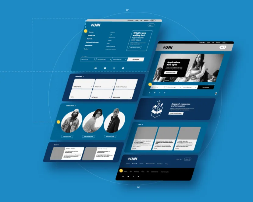
Designing a website for a university or college is a bit like designing a busy, beautiful city that has to cater to everyone from hurried commuters to sightseeing tourists.
In the world of higher education, an institution’s digital presence is the front gate, the prospectus, the lecture hall and the administrative office, all rolled into one.
It’s a big task, but it can work if the focus is on user-centred design and a sturdy information architecture.
The many faces of a higher education user
The first rule of university web design is simple: you’re not designing for one person. You're designing for a minimum of five distinct, and often impatient, user groups.
For example, a prospective student is both trying to imagine what a future would be like here in parallel with needing detailed information on a course that they're interested in pursuing; a staff member just wants to find the holiday form.
Higher education website users
- Prospective students: admissions information, programme details, campus life, virtual tours, and a clear path to an application form.
- Current students: single sign-on access to student portals, timetables, academic resources, and the learning management system.
- Faculty and staff: quick access to human resources systems, teaching tools, research funding information, and internal news.
- Alumni and donors: easy-to-find giving options, alumni event details, and compelling institutional success stories.
- Parents: financial aid information, accommodation and safety resources, and academic support contacts.
The key to success is creating clear, distinct user journeys for each group right from the homepage, rather than forcing everyone down the same path.
Structure is king
A large university website contains an overwhelming amount of information. If your structure is weak, users will get lost. This is where information architecture becomes your best friend.
Information architecture and navigation
You need a logical, hierarchical structure that organises content intuitively. Key categories should be instantly recognisable: courses, admissions, research, campus life.
The depth of your information architecture needs to be considered carefully. With thousands of programme pages, research reports, and policies, navigation can become a sprawling nightmare.
Although it can be tempting to try to include everything in your primary navigation, a more sensible approach can often be keeping to a more minimalist primary navigation, with a natural progression of child pages underneath guiding the user to key sections of the website to continue their journey.
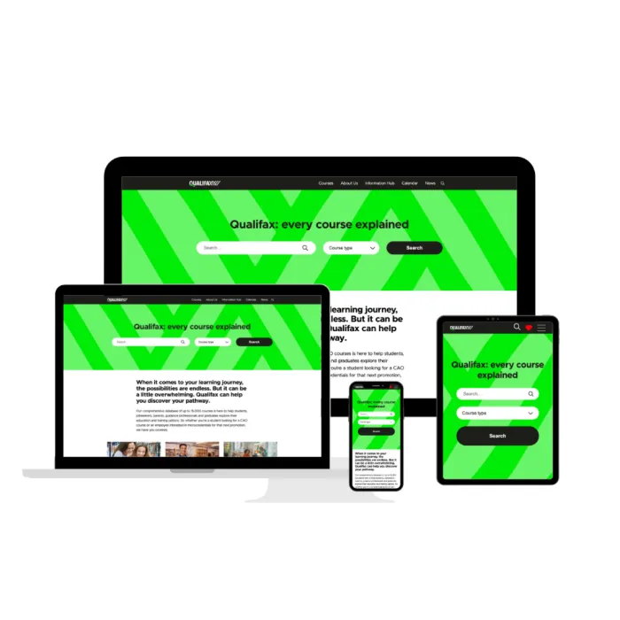
This was our approach with the award-winning education portal Qualifax. The site’s architecture was pared down immensely, from a massive amount of overwhelming information to a simple design that hinges on a sophisticated Solr search for both the massive course library (more than 15,000 constantly updated courses) and the popular events calendar.
Consistency is king: make sure your navigational elements and labels are the same across all departments.
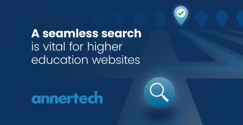
Robust search functionality
Given the sheer volume of content, search functionality must be robust and reliable. As mentioned in the example of Qualifax (above), users should be able to search for specific information which is relevant to them.
This simply means that it may be particularly useful for one user to search for courses by title or keyword, whereas for others location may be a key deciding factor.
It shouldn't just be a simple keyword match; it should be an intelligent tool that quickly cuts through the clutter.
Integrations and single sign-on
Higher education institutes are rarely a single website; they’re an ecosystem of crucial systems. For many authenticated users, the website is the gateway to student portals, learning management systems, library systems, and other back-end tools. To keep current students and staff happy and secure, single sign-on (SSO) is non-negotiable.
SSO allows a user to log in once and gain seamless access to:
- Student portals
- Learning management systems (LMS)
- Library systems
- Internal faculty tools
- Events calendars
The design here isn't just about aesthetics; it's about a frictionless user experience. A poor log-in journey or clunky integration between the main site and the LMS can cause immense frustration. We see this challenge all the time, which is why we specialise in consolidating these experiences.
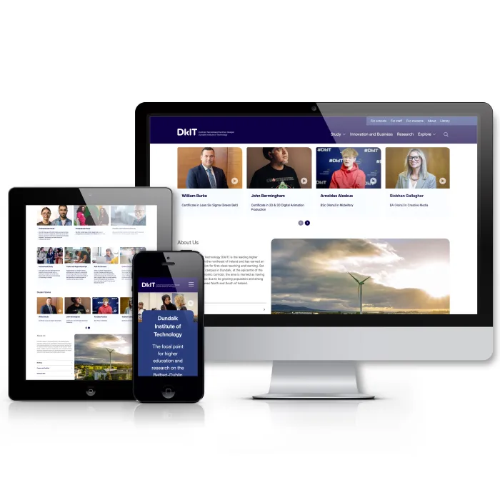
For example, our work to create a unified digital hub for Dundalk Institute of Technology (DKIT) focused on integrating fragmented systems to deliver a clean, simple interface for staff and students. This consolidation provides a single source of truth and a vastly improved daily experience for every user.
Accessibility and mobile-first design
For a public body like a university, accessibility is not just a nice-to-have; it's a legal and ethical requirement. The need to meet particular accessibility standards, such as WCAG 2.1 AA (or 2.2), is crucial for inclusivity and to avoid legal risk. This means ensuring:
- Strong colour contrast
- Keyboard-only navigation
- Descriptive alt text for all meaningful images
- Clear semantic html for screen readers
Furthermore, many of your users, particularly prospective students, are accessing your site via mobile devices. Your site must adopt a mobile-first design philosophy to ensure the experience is smooth, fast, and accessible on all screen sizes.
This involves:
- Fast load times: compressing images and optimising code. Gen Z won’t wait around.
- Finger-friendly navigation: buttons and links need sufficient touch targets.
- Scannable content: breaking up large text blocks with headings, bullet points, and concise paragraphs for quick consumption on a small screen.
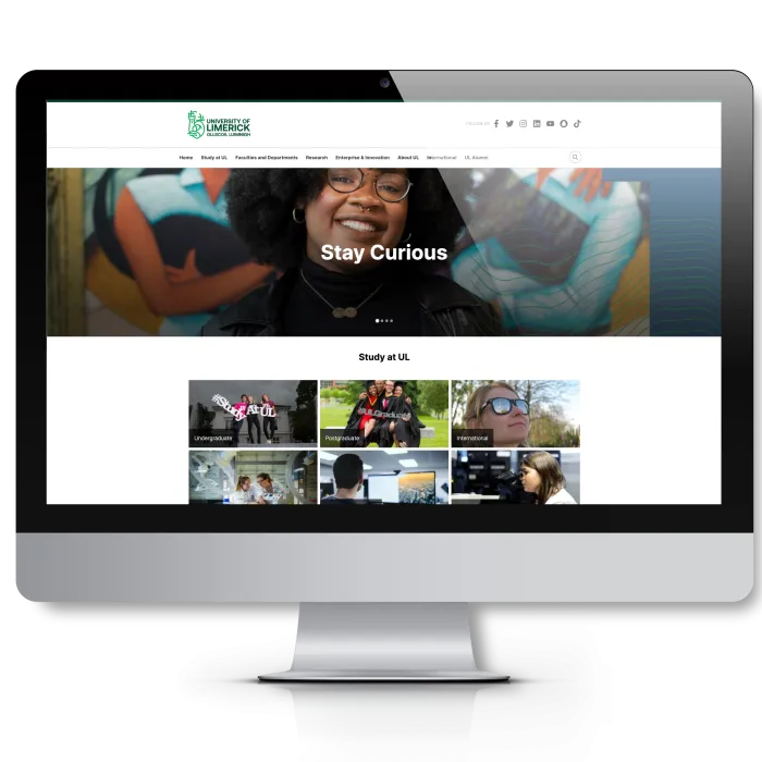
A few years ago, as part of its first accessibility monitoring report in 2021, the National Disability Authority (NDA) tested the University of Limerick’s website. Its feedback included an overall accessibility score of 24.62%.
Over the next year, we worked on the accessibility issues, including common issues such as colour contrast ratio and parsing issues.
Today, the University of Limerick’s website is a lot more accessible. The NDA's 2024 monitoring report scored it 89%. Ul.ie currently scores 92 on Lighthouse – and is in the process of being rebuilt, with accessibility baked in from the beginning.
Conclusion
A successful university website blends an engaging brand presence with rock-solid utility.
By keeping the needs of every user group front and centre, you build a digital asset that not only recruits future talent but also serves the entire academic community efficiently.
Sean helps ask tricky questions to guide Annertech's clients from concept to creation.
Related Blog Posts


Need to upgrade your university’s digital campus?
Talk to Annertech about building your next higher education platform